Flat design, the view from my sun lounger, and the power of colour: tools to revitalise publishing design

Suzanne Kavanagh is a strategic market specialist and programme curator working with BookMachine Works and the BookMachine community. She worked with Sophie O’Rourke, our Editorial Board member to curate the BookMachine Unplugged: Talking Design event.
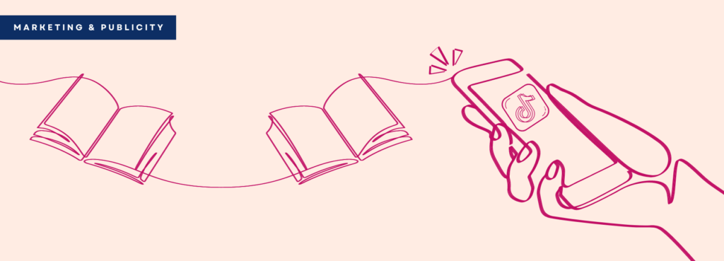
Publishing has always been a reactive industry – we are so often led and influenced by what’s going on around us – and visual trends within book design tend to come from outside of publishing, and increasingly coming from our use of technology and the convergence of online and offline.
We are surrounded more than ever by images and visual content. The majority of us are glued to our smart phones. We take images and curate our own visual narratives through Instagram, Snapchat, Facebook and whatsapp. We are part of the consumerism of these media channels, constantly checking our feeds, watching friends’ stories and viewing “sponsored” content. This drives a new level of sophistication and appreciation of design elements such as colour, typography and layout.
So how can we make sure that the design of what we publish to our readers is the best it can be? Are we using the right tools to do so? And have we acquired the right knowledge and skills to be able to adapt to what’s changing in – and beyond – our industry? The BookMachine Unplugged: Talking Design panel described the key developments arising from this wider context.
Flat design is a visual trend that has emerged from the web. It has had a significant impact on the design we see in both digital and print communications in publishing, with designers often asked to “make it look like Google”. Chris Evans, Creative Director at Sherry Design, a design and branding studio in London and Sydney, observed that it was a reaction to Flash design, where content was heavy, rich, lifelike, and very slow to load. Flat design 1.0 soon showed its limitations and what we see now – Flat design 2.0 – is a leaner, cleaner, more beautiful iteration.
Positives of flat design: 1) simplicity, ease of navigation 2) flexible grids for diff devices 3) high-impact visual aesthetic 4) integrate type, colour, graphics, imagery, animation and illustration – beautiful curated. #BookMachine #graphicdesign pic.twitter.com/h424TwFcyb
— Head & Heart (@HeadHeartBooks) June 20, 2018
https://platform.twitter.com/widgets.js
So much of the imagery we see comes from our use of social media sites like Instagram, SnapChat and Pinterest. The “view from your sunlounger” epitomizes the “self-centred” style of photography that we see everywhere. And brands are constantly looking at ways to evolve their presence on these channels and “jump on the user created” content trends.
Beautiful #Instagram grids… ? Talking themes and trends with @sophie_orourke. #BookMachine pic.twitter.com/N1iqMooaG0
— Head & Heart (@HeadHeartBooks) June 20, 2018
https://platform.twitter.com/widgets.js
Sophie O’Rourke, Director at eMC Design, and our host for the evening talked about the pervasive power of Instagram. She showcased some of the image trends emerging from the platform to help publishers re-think their Instagram strategy.
Some good insta data at #BookMachine event Talking Design. pic.twitter.com/3GhcT44MP9
— Fallon Leung (@fallon_liang) June 20, 2018
https://platform.twitter.com/widgets.js
While the rise and commercial/visual power of “influentials” on social media channels is staggering, there are some fundamentals of good design that aren’t given nearly enough attention. Karen Haller, a global authority in the field of Applied Colour Psychology, has over 20 years’ experience studying and working with colour. She works with corporate clients and individual designers to show how psychology informs design and brand identity.
Colour is such a fundamentally powerful part of visual design: brands use it to emotionally connect with their customers. Why? Because up to 85% of our purchasing decisions are based on colour alone, but we are only 20% conscious of the colour choices we make. And yet so little time is devoted to it in design training.
Haller provided a framework for us all (from marketing to editorial, design and production) to use colour to create a positive emotional connection to our books, authors and brands.
1. Context: what is the age, gender and cultural background of the consumer?
2. Personality: genre, purpose and intention are key.
3. Experience and behaviour: what experience do you want to evoke, how do you want the reader to think, feel and behave?
4. Select specific tones of colour: reflecting all of the above, taking into consideration chromatic intensity.
5. Create the tonal colour palette: colours have visual tonal relationship, taking into consideration proportion and placement, to make that positive emotional connection.
She closed with a call to consider colour first: it shouldn’t be an afterthought once design has commenced, but an integral part of the strategic planning.
Fantastic and thought provoking event at @BookMachine, there is more to design than meets the eye! #bookmachine #talkingdesign
— Rhiannon Griffiths (@rhiannonlouisa1) June 20, 2018
https://platform.twitter.com/widgets.js
There is so much more to design than meets the eye, and in an age of digitally infused design styles, user generated content, people-powered recommendations, and a sophisticated audience who get to tweak their own visuals, being aware of all these trends is crucial to finding clear, compelling and stunning design for publishing.