Your 300dpi images may be wrong for two reasons

This is post by Ken Jones – member of the BookMachine Editorial Board.
 I spoke at the recent BookMachine Unplugged event to challenge some of the received wisdom that designers and production staff follow even though they probably no longer should… in this post I take on our use of 300dpi images.
If you are using 300dpi images for your commercially printed illustrated publishing then I suggest they may well be wrong in two ways:
1. the 300 part
2. the dpi part
It’s PPI not DPI
Let’s tackle the second point first. It may be seem pedantic but actually DPI stands for dots per inch and we have not used dots for our digital images since, well… since digital images were invented. It’s not a big thing, I usually let it go, dpi is used as slang for pixels per inch but when trying to understand the complex business of image resolution let’s be clear and correct here.
I’m not talking about whether you have been mis-sold loan protection in the ‘90s or a condition you may get from public swimming pools. PPI = Pixels Per Inch.
I’ll leave the fact that we are stuck still using inches when our pages are measured in millimetres (unless you are in the US) to another time.

Why do we use 300?
All designers have been taught along the way that 300ppi (or 300dpi for you diehards) is the guarantee of good quality but the magical number of 300 for a top quality image can be challenged for a few reasons.
1. Is it a sharp image? Some images can still look as just as good at lower resolution. A background image of some fluffy clouds really doesn’t even need to be 200ppi. Only images which need sharp detail benefit from such high resolution.
2. Is it a good image? Whilst a sub 100ppi image is bound to have no sharp detail when printed, a bad image (perhaps blurred, badly exposed, or just plain wrong) will still look bad at 300ppi. It will just be a high quality bad image. Numbers alone cannot be relied on to guarantee quality. To check the quality of your images there is no shortcut to actually looking at them at 100% zoom in Photoshop.
3. Who is your printer? Commercial printers can print more dots than they used to be able to. The figure 300 actually comes from a simple doubling of the number of halftone dots the printer can achieve on press (halftone dots are actually measured in LPI for ‘lines per inch’, just to confuse you). As our commercial printers now regularly use 175lpi line screens and some go to 200lpi, so for maximum quality we should now aim for 350ppi or sometimes 400ppi.

Being Effective
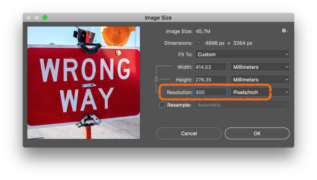
InDesign can apply visual effect such as fades and blends to change the appearance of our images when output but it never adjusts the actual images in the same way we do in Photoshop. Scaling and cropping are the most common image adjustments and are applied to the most of the images we publish. They both relate to resolution.
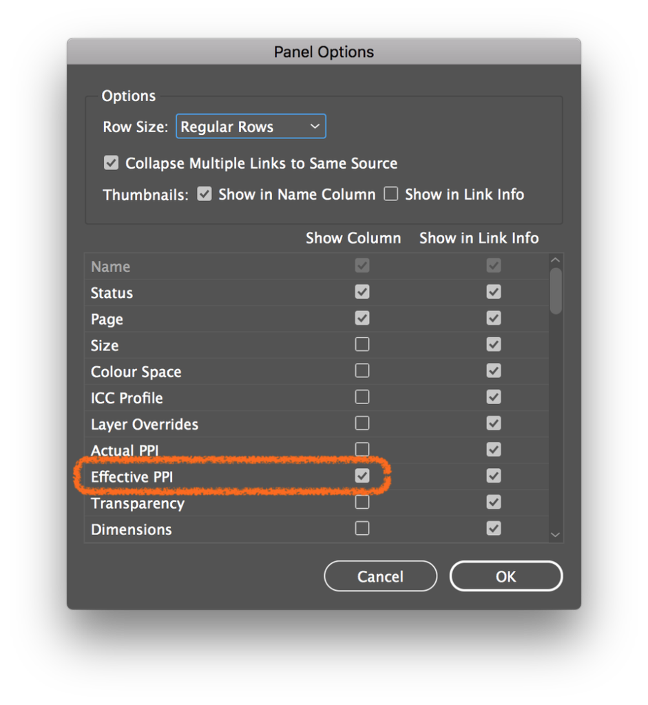
Resizing the image on the page will change the ‘effective resolution’. As soon as you decrease the image size you effectively increase the image resolution. Let’s not get into the maths of it here, instead I suggest you switch on the effective resolution column in your InDesign Links Panel Options.
Cropping into part of an image will also have an effect of scaling up and decreasing the final image resolution. By blowing up part of an image you will of course be reducing the effective resolution.
So, the next time someone asks for a 300dpi image and you are feeling brave, you could ask them ‘why exactly?’ If you do, let me know what they say!
Photos by NeONBRAND, Jason Blackeye and Sam Poullain on Unsplash


Very useful post, thank you. Would you recommend switching on effective resolution in Illustrator as well? And if yes, where would we find it? (Asking for a friend…)
Hi Suzanne, glad you liked the post.
In Illustrator, there is no way to get info on a whole list of links, but the info is in there. Tell your friend to select a placed pixel image and and check the PPI (not dpi!) reading next to the image name in the control bar at the top.
BTW (Window menu > Control) to show that bar if it is not already showing.
Very useful information here. Many thanks.