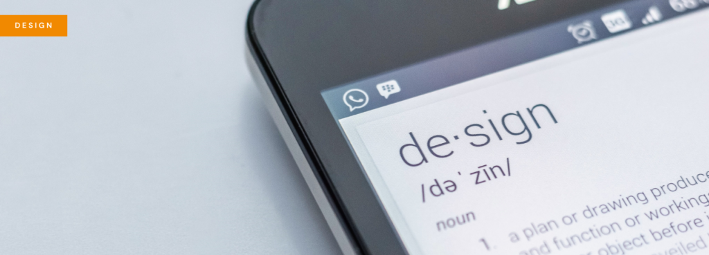
Book Cover Design for Self-Published Authors


It’s a popular myth that the book cover is dead , but unless bricks and mortar bookstores and online cover thumbnails disappear, that simply isn’t true. In fact, a book’s cover is an integral part of the customer’s buying process because it acts as a signpost for the book’s contents. If your book has the right cover design, genre, intended age of reader and tone can all be communicated in a split second.
Most traditionally published authors have their book covers designed for them by their publishers but self-published authors have to do it all themselves and it’s a hard task. So, here are some top tips to help all you budding book cover designers out there!
Starting out: don’t try to different
There’s an old saying that we should never judge a book by its cover, but the truth is that browsing readers do it all the time because trends in cover design help indicate a book’s contents. Distressed fonts, for example, can indicate a dystopian setting, while images of couples tend to be used for romance. A cover needs to fit these trends in order to attract the right readership.
The best place to begin thinking about the design of your book cover, therefore, is to research your audience and examine the covers of the books they’re already reading. Go to the section in a bookstore with a similar genre to yours and compare your cover with the books there. If your cover sticks out like a sore thumb, it’s time to go back to the drawing board!
The nitty gritty: software, images and size
Despite differences across genres, there are some general tips that can be applied to most cover designs.
Firstly, go for a big, bold title. This is particularly important now covers are so often seen as thumbnails in online stores; it needs to stand out even in that tiny format.
Next, don’t forget the spine and back cover! A print book is a three-dimensional product and with many self-published authors’ emphasis on digital this can get overlooked. You need to make sure your cover looks good from every angle, especially if you’re getting your book into a bricks and mortar store.
On a similar note, make sure you get your blurb and cover reviews spot on. Check for typos, and make sure your copy is as engaging and exciting as it can possibly be. If in doubt, compare to other books again and see how you’re measuring up.
Next, know your dimensions and resolution requirements. Quality is incredibly important, with most printers recommending the same image resolution as a computer screen. Being clear about your production budget and processes before you begin designing is highly recommended, so that you know your book’s dimensions and bleeds from the start. When creating your cover, if you don’t have the time to learn Photoshop or GIMP, you can use a simpler program, such as MS Word or one of the increasing number of self-publishing platforms.
Resourcing images for a book cover can seem like a daunting task, but there are some great photo resourcing platforms out there to help you on your way. If you do decide to take photographs yourself, bear in mind the tone of your book and think about your background accordingly: the darker the background, the darker the content.
It’s all good publicity
Finally, ask other people what they think of your cover. Use social media to help figure out what works and what doesn’t and if you’re consistently struggling with covers, don’t rule out hiring a professional to design your book cover for you. It can be pricey, but book cover design is a pretty involved science, and if you keep getting it wrong but your writing is good, it might be worth it to invest.
Ultimately, a cover is a way of getting people to open your book: once they’re inside, your writing can speak for itself.


Interesting article Jasmin. Book cover design is more important than ever before, especially as readers are viewing covers as thumbnails on screens. You really have to grab the attention!
My 2 pence for what it’s worth…
Be careful with free fonts; the price is nice but they can have dodgy kerning and inconsistent quality. If you can afford it, try to buy decent ones.
Most printers definitely don’t recommend the same quality as the screen! Screen resolution is 72dpi and print needs to be 300dpi. Check the dimensions carefully if you’re designing for an online or offline store.
Cover design doesn’t have to be pricey. Sure, if you want a complicated illustration it will be, but if you have a photographic idea in mind you might be pleasantly surprised.
Really good advice – I really agree about free fonts. Also, go for fonts which are interesting to look at but still easy to read, I think that’s very important. Nobody’s going to buy your book if they can’t figure out what the title is!
Great post, and something I often come across. I will definitely be referring authors to these points.