Cover Design Process: The Right Type
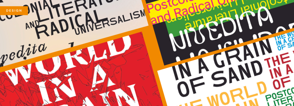
Serif? Sans serif? Condensed? Old-style? Grotesk? Quirky? Utilitarian? When it comes to selecting the right typeface for a book cover design, it seems there are countless choices from which to choose. Over the years, there were certainly favourites: Akzidenz Grotesk, Sabon, Monotype Grotesque, Freight and others. Lately, though, I have been intentional in moving away from those workhorses in favour of more unique and interesting typefaces (often Open Source) by emerging type foundries and designers.
My approach to selecting the right typeface has often been rooted in equal parts intuition and typographic history. I would begin a project by asking myself, “Does the typeface fit?” What I meant was, is it appropriate for the subject matter? If a particular typographic decision results in confusion for the reader then it may not be appropriate. For example, using a blackletter typeface such as Fraktur would not be best suited for a book about native wildflowers of the mid-Atlantic United States.
New project, new approach
My more recent work for publishers, however, has had me wondering who decides what is “appropriate”? I began to sense that the way I was working might be upholding the status quo in regards to typographic cover designs. In the case of a recent project for Verso Books, I decided to take a different approach to the cover design process. The World in a Grain of Sand is a book about literary theory that critiques the ways in which writing from the global South has been seen in perspective to Eurocentrism. It represents a way of thinking about writing known as “radical universalism”. The design brief from Art Director Melissa Weiss is exactly the kind of brief I hope to get from my clients because I like to think it means we are on the same page (see what I did there?): “We are open-minded about possible directions, but recommend a typographic approach.” What an opportunity to try something new!
Option #1: Not Quite Right
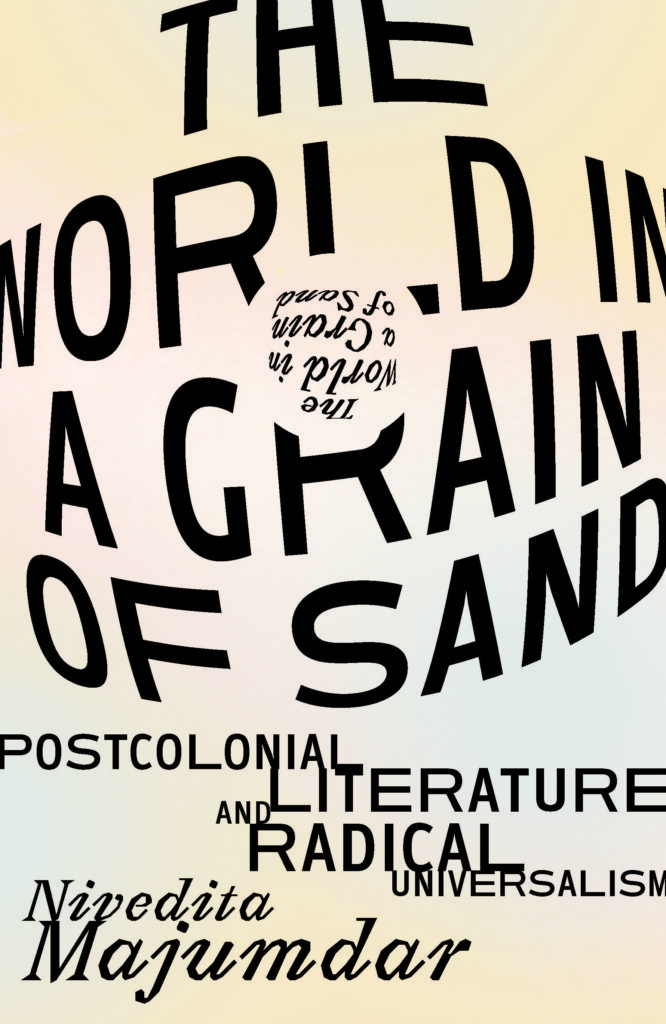
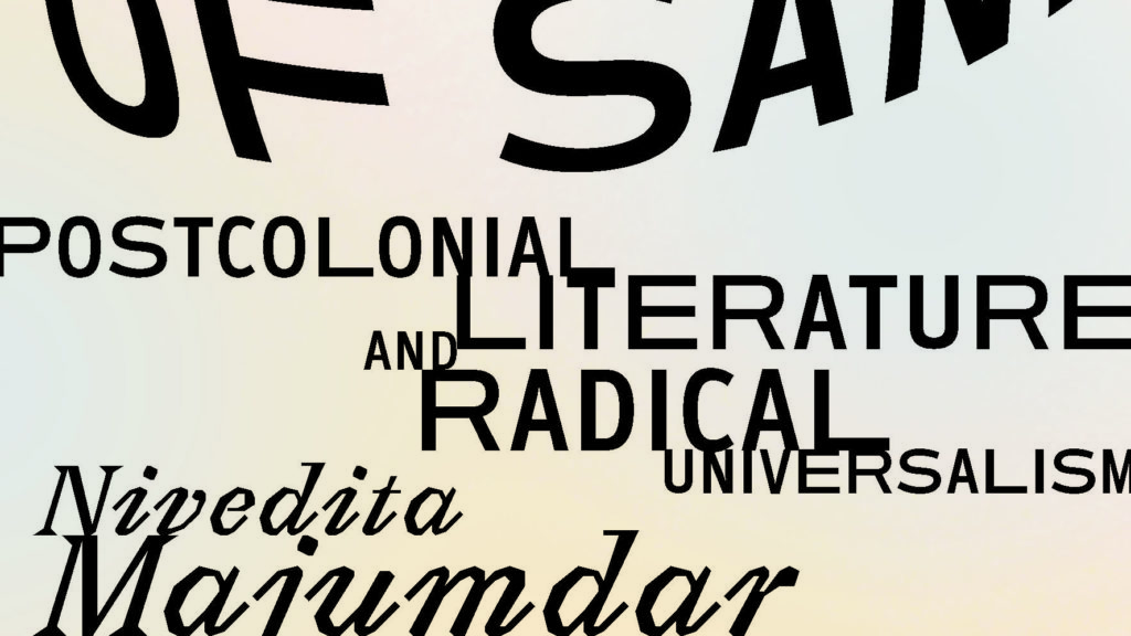
This early cover option used a typeface called Ambiguity by Charles Nix (Monotype). What was particularly interesting about this choice was that the styles of the typeface were named for non-visual qualities: Normate, Tradition, Thrift, Generous and Radical. The Radical variant, with its inconsistent type widths, seemed to accentuate the concept of language in a way that was rather off-centre. In the design of this cover, I chose to distort the typeface – the title reads as a globe, a world within a world – and align the subtitle to stretch from edge to edge.
Option #2: Feeling Lost
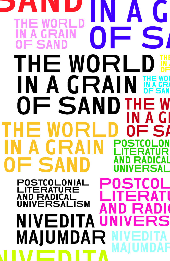
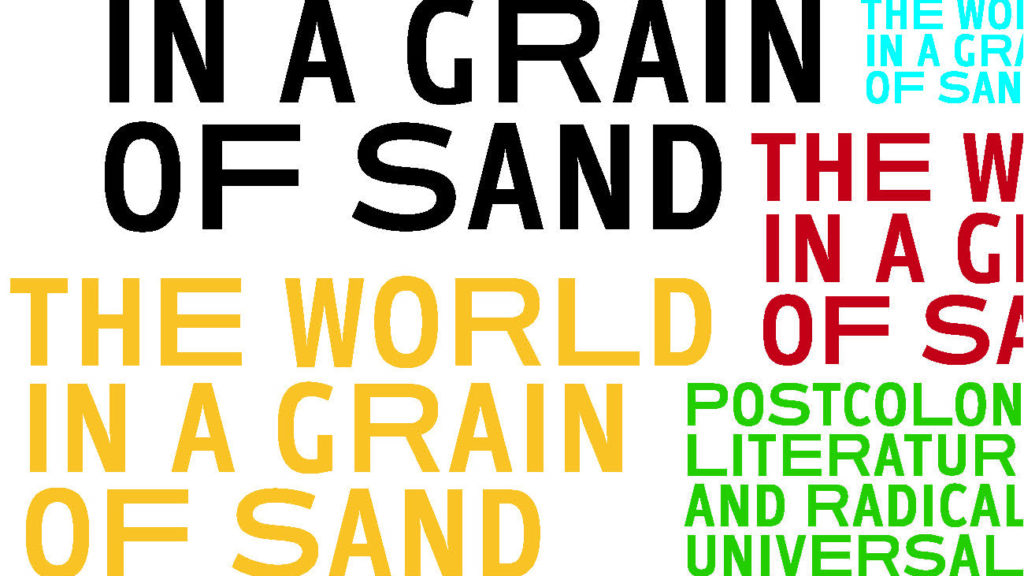
A second option, seen here, also makes use of Ambiguity Radical. This particular design features a field of typographic “lockups” of the title, subtitle and author in a rainbow of colours at different sizes. The goal was to convey pluralism through the typography. In truth, this would have worked better had more than one typeface been used. At this point in nearly every project is when I start questioning if I am even headed in the right direction.
Option #3: Getting…Somewhere?
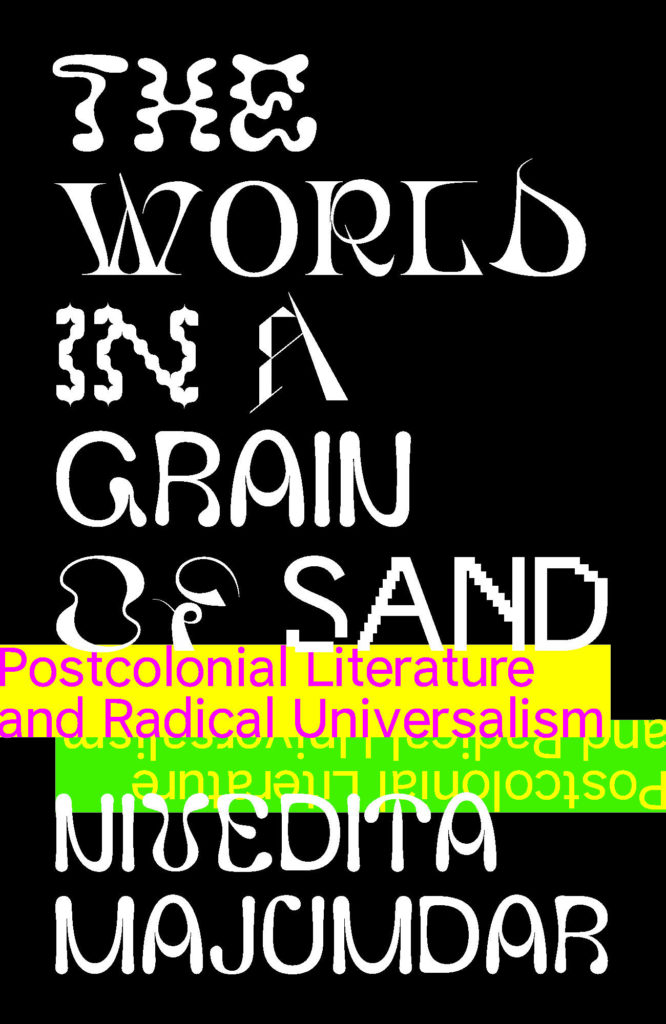
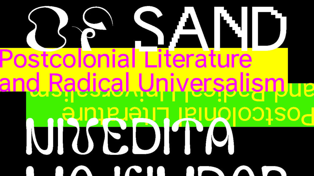
The next cover option designed for this project made up for the lack of typefaces in the previous option by using all 9 (!) weights of GlyphWorld. GlyphWorld is quite possibly one of my favourite typographic design projects of the last few years. This experimental typeface makes most others seem tame – boring, even. Don’t believe me? Here is a description by the designer, Leah Maldonado, “The project pushes the boundaries of what a typeface can be by using the medium of letterforms to reflect an emotional connection to our environment.” Accordingly, the style names follow suit: Forest, Meadow, Flower, Mountain, Airland, Animal Soul, Glacier, Desert and Wasteland. I treated the cover design as simply as possible, letting the letterforms do all the work. The subtitle is repeated and flipped, a metaphor for the idea of ‘hemispheres’ in the book.
Option #4: Falling Apart is a Good Thing
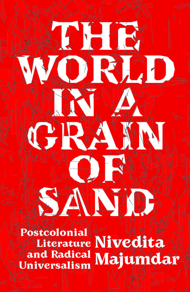
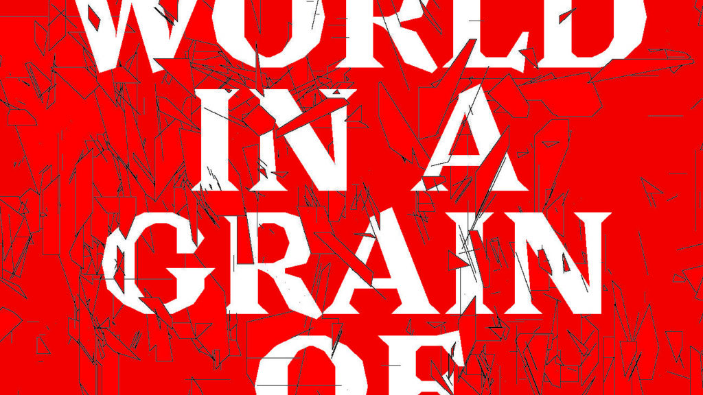
Another option that I proposed for this project was the one shown here. This was actually the first idea I had for this title, and it was also my favourite. The typeface is Avara by Velvetyne, an open source type foundry. Created by Raphaël Bastide, with contributions from Jérémy Landes, Lucas Le Bihan, Walid Bouchouchi and Wei Huang; this typeface features no curves and offers a somewhat brutal, and beautiful, take on a serif type. Avara’s wedge-shaped serifs and angular forms begged for it to be deconstructed and remade into something new – much like humans have done with language since its inception. So that is what I did. I broke down the letters in the book title and reassembled them into slices, shards, slabs, and slivers. Those fragments then became both background noise and texture, overlapping and obscuring the text – building blocks of letters and words.
Lessons Learned
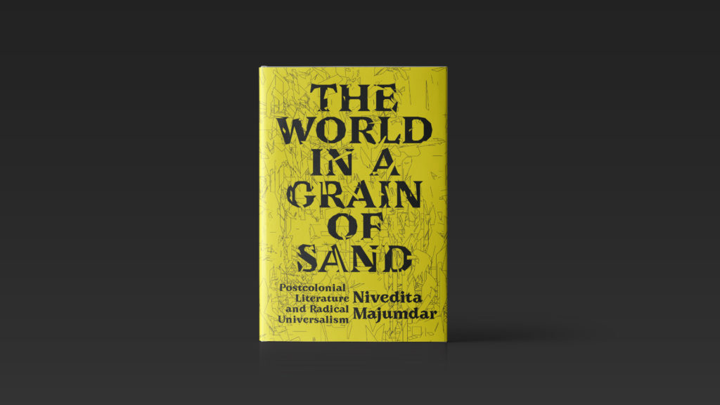
Ultimately, this direction was also the one the publisher and author favoured the most. After a few rounds back and forth to settle on the final colour: yellow, it was done. The centred layout is traditional, but the baseline (the imaginary line that a line of text sits upon) misalignment of the subtitle and author’s name feels uncomfortable, like a rule that ought not be broken.
The final cover represents a change in direction for my work in a number of ways. In addition, important lessons were learned along the way (a lot of these are inspired by Sister Corita Kent’s Rules for Students):
- Always take risks
- Hold onto all of your ideas, even the “mistakes”
- Break rules, often
But mostly, it makes me grateful that I am entrusted with the responsibility to give shape and form to the powerful, creative, and radical ideas found in books.
Jason Alejandro is a freelance book designer, art director, and educator. He has worked for such publishers as Princeton University Press, MIT Press, Oxford University Press, and Verso Books. You can find Jason on Twitter at @jasonaalejandro, on Instagram at @jalejandro, and LinkedIn at https://www.linkedin.com/in/jasonalejandro/.



I love seeing all the directions Jason explored before landing on the winner! Typography is the very dna of graphic design!
It’s a really hand blog post! Thanks @Secondari
So insightful!
I love this piece so much! Thank you @jasonalejandro for your insight into the design process.